Posts

If at first...

Image
  Struggling with some of the final details and terrible handwriting but got there in the end!

#IIC Clare Youngs Decorated Paper

Image
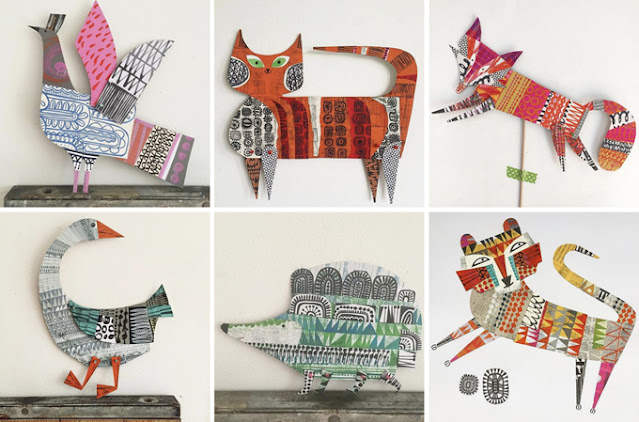
I have been following Clare Youngs on Instagram for quite a while now and she appears to be prolific as there are new posts with different work almost daily. Her work has some parallels with Rex Ray - her use of hand-decorated papers, collage and pattern - and it is very playful with beautiful use of colour, shape and pattern. I am starting to think ahead to the next panel, 2018-19, and I hope to experiment with some of these methods, particularly creating decorative papers that can be cut out for leaves, animals etc. (whilst remembering the lesson learned from copying Matazo's smoke!).  https://www.clareyoungs.co.uk/about

Smoking

Image
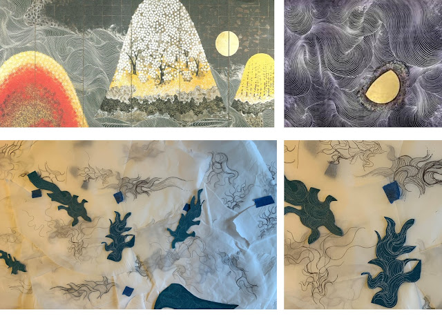
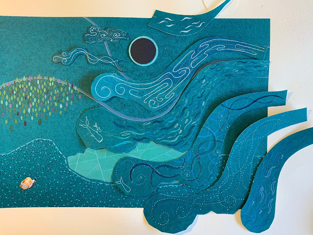
A lesson learned: I am very drawn to the work of Kayama Matazo - colour, shape, pattern and composition - and I thought the way he draws water could help me with the Grenfell Tower problem: to create the sense of 'after the fire', smoke turning into clouds and dawn breaking. However, a day of trying to replicate his folding lines resulted in frustration, drawings of ugly muscles and little more! So I 'returned to type' the next day, spirals and circles (peeping sun borrowed from Matazo) and I am happy  with the result. The tower is also resolved, 72 windows representing the people who died, the colour is a magnification of a butterfly wing to represent the colour and brightness of the lives that were lost, rather than the fire itself, and also the fleeting nature of life. I will slot the names into the book too.

#IIC Michael Geddis

Image
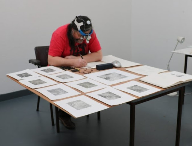
A new discovery! This artist, a former veterinary surgeon, makes incredibly detailed drawings of microscopic imagery using the full range of graphite tones, they are described on his website as 'cellular landscapes'. The drawings are decorative, sometimes drawn from the imagination/memory and evoke different scales of space (familiar themes); his posture and magnifying glasses are also striking a chord, so I don't feel quite so bonkers now... https://mycreativeedge.eu/profile/michael-geddis-art/ Retrieved 12.08.2022

#IIC BABE: Bristol Artists' Book Event

Image
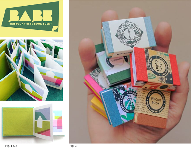
The Bristol Artists' Book Event was a revelation to me, as I think I now  know how and where to share   Time After Time  when it is fully formed. The range of creative practice was incredible and I  really  enjoyed the way much of it could not be defined using conventional art terms such  as  panting,  printing, and sculpture, fluid and inclusive practices. I was very inspired by the range and quality of work, the associated artists' websites and the work we purchased. As I prepare to exhibit and perhaps sell my work, my challenge will be in the setting out and finishing of books using In Design, Illustrator etc. to create polished and professional-looking final products, so I have signed-up to Adobe classes in the autumn, a little late for the MA but part of the same developmental trajectory. Also, the UWE Book Arts newsletter is going to be a very useful reference for me to identify conferences and events, it's time to get my work out there. Fig...

Panel Two 2018-2019

Image
I am so pleased to take some time to think about the next panel and prepare stencils for the key elements (which need to be repositioned a little, to balance the overall image). I hope to start working on this in September and perhaps complete it by Christmas as some of the time-consuming elements have been resolved when making the first panel: dotting the ground, the combination of screen-printing, stenciling and approaches to collage, and drawing people.

Water, Water Everywhere - and I am still not quite sure how to do it!

Image
I have reached the final, 4th plate of the 2016-2017 panel and experimenting with ways to depict the Whanganui river in New Zealand, that now has the same legal rights as a person: drawing, collage, painting, printing and looking for inspiration from the way water is represented in Japanese art. I am finding this element of the panel very tricky indeed as I don't want the approach to look too mannered and I also don't want to repeat methods I have already used. I will keep testing ideas. Slow as always, but perhaps this is one of the points of the work: marking time. Fig. 1. Ogata Kōrin,  Red and White Plum Blossoms , Edo period, 18th century Fig. 2. Tour of Waterfalls in Various Province, Hokusai Fig 3. Masculine Waves , ceiling panel Hokusai Fig. 4 & 5. Landscape with the Sun and Moon ,  jûyô-bunkazai , unknown artist, mid-16th century, Kongôji (Ôsaka Prefecture) Fig 6 & 7 Star Festival, Kayama Matazo: The incredible detail in this modern painting / collage is...
#IIC Tyneham: more artist's books on the horizon

Image
  My colleague and I have just heard that we have been awarded £4K in Conservation and Heritage funding to develop a collaborative research project at Tyneham. This first round of seed funding has to be spent by the end of July, so we are going to be busy visiting the site and contacting potential collaborators from the MoD, the University, the local community - artists, educators, descendants of the villagers - as well as museums and research institutions.  If the project attracts further funding, we hope to use the site for undergraduate and postgraduate studio projects but also to develop practice-research by using a range of creative methods to visualise and document the hidden histories of the abandoned village. This will be a perfect opportunity for me to develop my illustrative practices/artist's books as research (alongside Time after Time which could take another year to complete at current speeds!) - an exciting way to link my artwork and lecturing work. 

Animating with Procreate and Mental Canvas - a mental break

Image
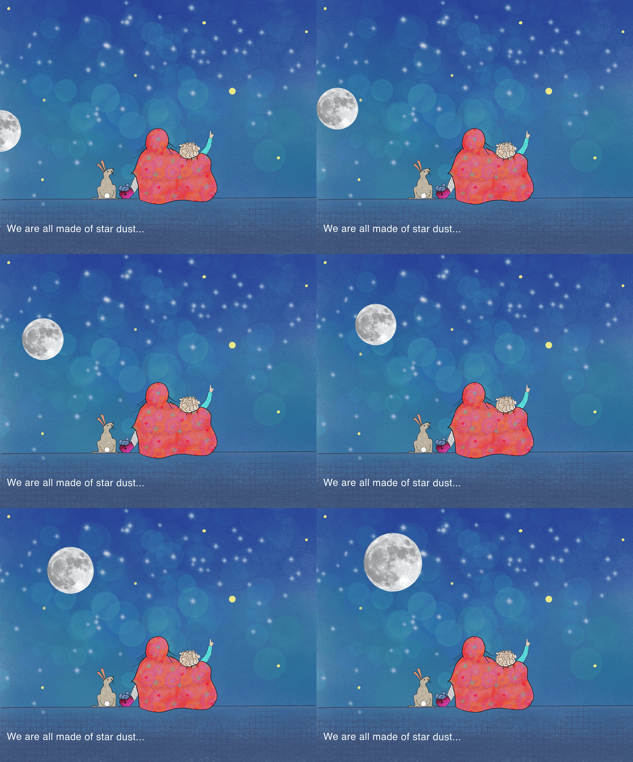
I have taken a break from my hand-crafted work today, to play with Mental Canvas and Procreate. The image above is an illustration for a series of lovely children's stories my sister has written; I am not the person for the job but it has been fun to develop some skills. The sketch below is my first using Mental Canvas, a toe in the water with so much more to learn!  

Collage paper, tone, tints and outlines

Image
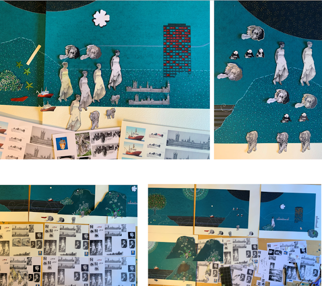
 To test tonal contrast, paper colour and tinting, I have printed dozens of versions of Jo Cox, pandas, Alan Kurdi, tigers, the Aquarius rescue ship, cherubs and Trump on different papers and with different print-settings. I am about to stick the first collage elements to the background so it is a pretty crucial decision. The to right image shows a choice between the shortlisted approaches and I opted for tonal contrast on a white background with fine black or fine white outlines depending on location. To my eye, this approach seemed to be more punchy and complemented the painted elements more effectively. Now to commit and glue!

More tiny leaves

Image
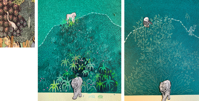
 Many more tiny leaves. Leaves on a hillside supporting recovering species of tigers and pandas; leaves and flowers growing around Jo Cox, her ideas living on; and leaves growing at the base of Grenfell (turning Grenfell into a living, green tower, has been suggested as a way to celebrate and remember the lives of those who were lost). The first leaves were quite naturalistic and inspired by the paintings in Garden and Cosmos, but these were too mimetic. The leaves-shapes of the second-attempt were more consistent with the overall design, but the colour too bright. The shape and colour of the Goldilocks leaves worked well but are taking an age to paint, a base layer of white required to achieve the vibrant colour I want...once again, it would be quicker to grow the plants! Overall, the colours of the panel need lifting, so I am also wondering whether to make the pale-blue dashes white, a decision that can wait a while.

Remembering Grenfell

Image
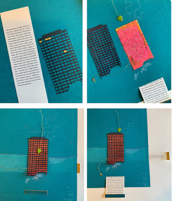
 I am returning to this tricky aspect of the first panel: remembering those who died in the Grenfell Tower whilst respecting those who still live and remember their loved-ones. After a number of attempts, I have settled on a screen-printed tower with cut-out windows to reveal a layer behind which will be shades of red, pink and gold (the bright lives and the fire). However, I also wanted to be specific, so I have decided to list the names of the 72 people who died as a form of memorial, a pull-out from the main image which can be revealed or hidden.

The shape and pattern of water

Image
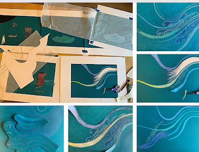
 I have finally got to the point where I need to complete the background for the 4th plate of the first panel, which includes a depiction of the Larsen C iceberg and the Whanganui River, a river which has been granted personhood in New Zealand, thereby able to claim the same rights as humans. The wavy lines connect the 3rd and 4th panel and shift perspective from elevation to plan-view (hill becoming sea and river). I have looked at examples of water in Japanese and Chinese paintings and have just started testing alternative approaches.

#IIC AHRA Situated Ecologies Conference: Presenting Time after Time

  The content and aims of my Major Project, Time after Time  correspond with some of the AHA conference themes and offer an opportunity to test the potential of the artwork to engage and activity audiences, an aim which was set out in my Project Proposal. So I have decided to submit a proposal to run a session as outlined below. I think this would be a great opportunity to exhibit and contextualise my work and also to collaborate with CT colleagues/research student, so I hope it gets accepted: “This is a dark time, filled with suffering and uncertainty. Like living cells in a larger body, it is natural that we feel the trauma of our world. So don’t be afraid of the anguish you feel, or the anger or fear, because these responses arise from the depth of your caring and the truth of your interconnectedness with all beings” (Macy and Gahbler , 2006, p.105). How technology can be used to augment analogue artworks and further engage and activate audiences. Delegates are invited t...

#IIC AHRA Situated Ecologies Conference Zine, 2023 DRAFT

 The zine-making workshop with Ceri Amphlett  was very inspiring and I enjoyed seeing examples of her work and learning about the potential of the zine as a very immediate and direct form of communication. I have since led my own zine workshop with MA students who used is it as part of their climate action activism, the success of this has given me the confidence to respond to a call for sessions from the Architectural Humanities Research Association around the theme of 'Situated Ecologies': Zines have a long history associated with campaigning, sharing information, telling the stories of marginalised groups and activism; they have been designed to circumvent mainstream media and institutions and to democratise political messaging. There is now a renewed interest in the relevance of the zine as a counterpoint to on-line information that is controlled and censored by social media platforms and news conglomerates: contemporary zine makers use the medium for activism - a medium e...

The macro and the micro / dots to dotty.

Image
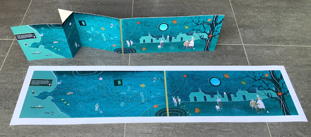
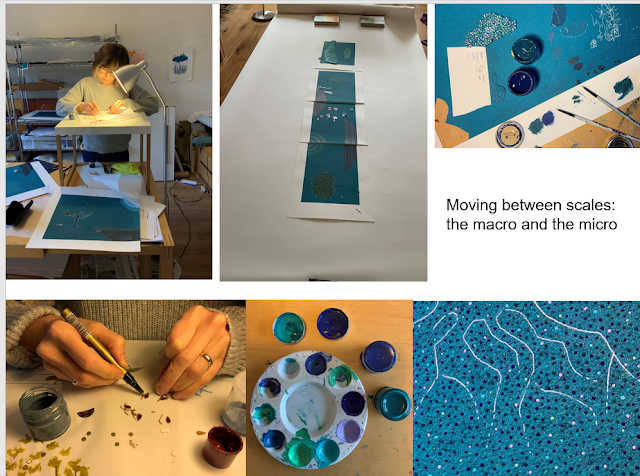
 It has become necessary to create a standing table, so that hours of painting tiny dots does not send my neck and shoulders into a two-day spasm (I must ask Kusama how she does it!). I am also trying to switch between painting very small details, to bigger shape-making, writing and thinking about the overall presentation: my next job is to cut a 1.6 metre long piece of watercolour paper and experiment with folds and cutting between layers.

One leaf at a time

Image
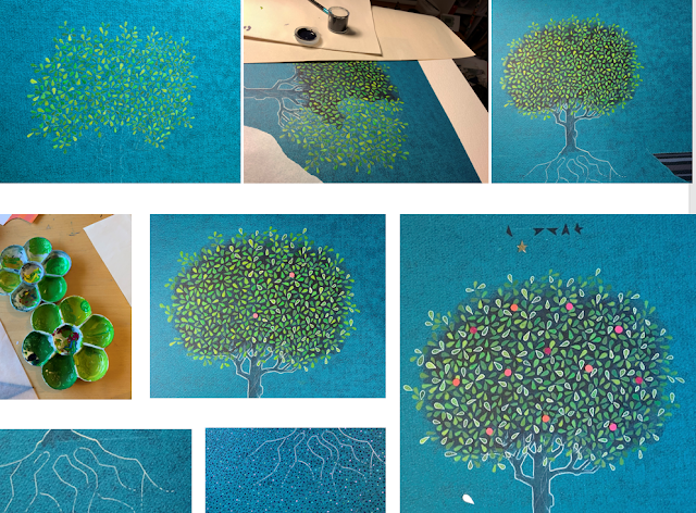
There is no rushing this process and I wonder if it might be quicker to grow a tree from seed! The tree has progressed one leaf at a time, with adjustments made to the shades of green (purer hues), the background (darker blue) and the addition of white outlines to improve the overall contrast and vibrancy. I am almost content but pink is needed to lift the colours, so I have decided to add fruit. This is a work about time and the human scale, so although the process is painfully slow, it is peaceful and I think the mark of the maker - the scale of my marks - matter. I will roll with the pace for now, one leaf and one dot at a time (see next post!), and concern myself about deadlines another day.

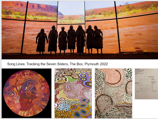
#IIC Song Lines: Tracking the Seven Sisters and Dots in Art

Image
I travelled to Devon to see this exhibition. It was created in Australia to address concerns that traditional stories and cultures were being lost; stories which are up to 60,000 years-old but that still have relevance today, as part of Australia's cultural heritage and as we reflect upon the relationship between humanity and the earth. The exhibition was designed to engage new audiences and particularly younger Aboriginal people who were in danger of losing connections with their song lines.  In Plymouth, the exhibition was located in several sites and there was a mix of contemporary paintings, immersive video art and sculpture; most of the artefacts were created by women in community settings or collaboratively with 10 or more artists. I have a long-held interest in Aboriginal art which was cemented when I lived in Australia and learned more about the landscape and the song-lines traditions. I am interested in the ways stories are told using symbolism in abstracted, cartographic ...

Background colour and surface: going round in circles and dots!

Image
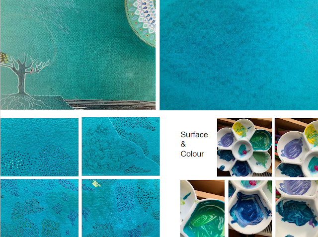
 I am pretty certain that after spending far too long identify the right colour for the backgrounds (not too blue, not too green, not too light, not too dark) and then screen printing 18 plates (with so many others that I rejected) that I have made a mistake with the choice of paper as it does not have the same surface texture as the mock-up, a deliberate change that I now think may be wrong. I am not sure if this is simply the process of testing and refining approaches or whether I have lost all sense of perspective and judgement! Green Mock-up: textile-like surface pattern                                Bluer screen-printed backgrounds, less regular surface pattern  (more sky-like but less variation). Testing how to give surface and colour to the 'earth' (beneath the tree and across all plates) - the ground needs to have tonal contrast with the background (darker) and to offer some visual relief ...