Posts

Showing posts from October, 2021

Background Colour

Image
 How can this be so tricky? None of the 22+ colours are right!

Taking Stock

Image
We have been back at work for a few weeks now and I am little frustrated that I don't have the time I would like to spend on my art work, so I thought this would be good to look at what I have achieved so far to - hopefully -  give myself a boost: Panel 1 2016-2017 is pretty well worked out in draft, and although there are many, many layers of the story to add and solve, the composition is more-or-less resolved and I am much happier with Grenfell and the fourth plate (the plan view of Larsen C is now recognisable as such). I have also worked out some of the techniques to be used which hasn't always been straight forward and I have spent crazy days on some elements; I hope this effort will pay off when I start the final version and the mock-ups for Panel 2 and 3.  I also have decided that I will use photographs of some of the prominent people in my work: Jo Cox, Alan Kurdi, Kadija Saye, George Floyd and now David Amess. I am going to use a technique whereby I print in black and

#IIC Nature and Us: a history through art

Image
 This is such a thought-provoking programme that charts humanity's relationship with the natural world, through art, from the earliest cave paintings to the present day (yet to watch). In episode two, I was particularly struck by the paintings of Ustad Mansur, a Mughal painter working in the early 17th C who documented the natural world in incredible detail and was the first person to depict a dodo in colour; his painting of a chameleon is also so well observed, a strong graphic image with layers of colour and marks used in relief to depict the skin of  the animal - I always enjoy a dot or two and this could suggest a way of painting my animals. The programme also made reference to the Chinese Painter Xiang Shenmo and his scroll painting, Reading in the Autumn Mountains, a beautifully composed image that shows humans as part of nature but also dwarfed by nature; I think the way trees and leaves are represented could be very helpful as I start to work on the detail of the plants in

Pattern

Image
I am going to refer to patterns from different cultures to support the symbolism in parts of the panels, for example, Islamic pattern in association with refugees in the Mediterranean, Aboriginal pattern associated with the Australian wild fires, Maori pattern in association with a New Zealand river, and African pattern in association with the Baobab trees. I have begun to research textiles, ceramics, and painting from these places and have begun with Islamic pattern: I started by hand drawing patterns using my drawing board, compass and circle template and then reminded myself I was once quite a proficient CAD user, so back to the digital board!  

Fire

Image
Fire will also appear on at least two of the panels as I will be depicting Grenfell Tower and the Australian and Californian fires. It has been such a struggle to find appropriate methods and the first attempts (many of them!) were far too decorative, and the filigree designs too mimetic and not true to the stories being told. I tried a number of alternative methods using pen, pastels and screen printing; I also referred to Japanese and Chinese scroll paintings for inspiration (images of war) and tried collage methods using painted paper (inspired by Rex Ray), but I was still not happy... The imagery was still too 'pretty' and decorative so I decided to think about the story a little more deeply to consider how to convey the tragic loss of life at Grenfell and the on-going injustices; the depiction had to be more arresting and shocking so I decided to use images of the people themselves - those who lost their lives at Grenfell - and to create darker, more representational paint

Trees

Image
No doubt, this will be the first of several days working out how to depict trees, as they will be important features appearing in all three scrolls: the tree of knowledge/life, the baobab trees, the eucalyptus trees in Australia and a tree that will be used to symbolise the Black Lives Matter campaign. I have been experimenting with screen printing silhouettes, drawing using line, collage and painting and I have also referred to Japanese and Indian artwork for inspiration:

A3 plates, the Goldilocks scale

Image
I have decided to use A3 plates as they work best with the scale of marks I make and A3 also offers the possibility of completing one or two of the panels by September 20221(!) and screen printing at home, which may be handy if I have to continue printing numerous backgrounds due to error or dissatisfaction with the colour! Now I have made this decision I can start to test approaches to some of the details and have returned to one of my favourite exhibitions/catalogues for inspiration ( Garden and Cosmos, the royal paintings of Jodhpur, at the British Museum). I have been studying the way plants are depicted and playing with the scale of marks and intensity of colour for leaves(improved by painting a white base coat before painting the individual leaves). I am also experimenting with ways of representing water (drawn lines, hand-painted bands of colour and/or dots) and checking my methods and line-types against work completed earlier in the summer. The coloured bands (right image) loo

Refining the composition of the second panel 2018-2019, using A4 plates

Image
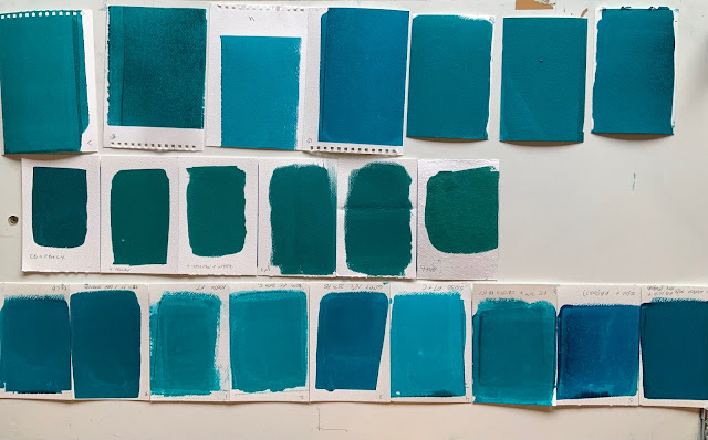
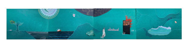
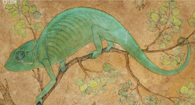
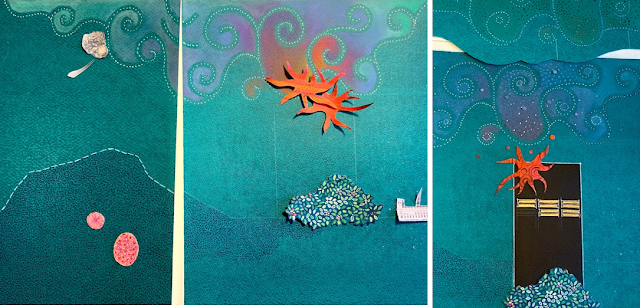
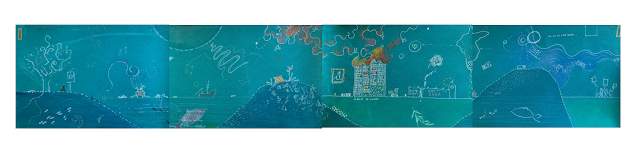
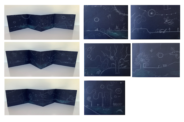
  The composition of this panel is a little stronger, although like the first, I need to refine the final plate. When I move up a scale, I will need to think about the balance between printing, painting, drawing and collage of real things or people, for example, I am thinking of using images of the first settlers in America to symbolise the 'caravan of people' who were trying to escape the terrible conditions in Venezuela by travelling to America...and meeting Trumps Wall. I am also going to have to test how to depict water, sea, rivers, rain etc. More fire to depict here, and again the challenge of drawing animals. I am not sure whether to include them as silhouettes, collages or drawings using line... This plate will have more detail, the plants and the 'lost' tortoise will be the main features and I have to remember it is about a balance of composition across the panel and across all three panels which will be 5 metres long...it is hard to keep visualising the detail

Refining the composition of the first panel 2016-2017, using A4 plates

Image
  2016-2017: starting to work out the use of tone and refining the composition across the plates. A pretty good start but when I stand back from this, I am not happy with the symmetry of the first two plates or the regular rhythm of darker 'lumps' at the bottom of the image; I am also unhappy with fourth plate which is unresolved at this point! Beginning the story, looking back at Alan Kurdi, sitting with the tree of knowledge Quick marks here will pose a challenge later: the plants, animals and how to depict fire. The intention is to create something which is beautiful to draw the viewer in and then provide a space to remember events such as Grenfell Tower and the death of Jo Cox (sadly joined this year by David Amess). The intention is also to convey messages of hope and optimism: 'we have more in common than that which divides us.'. Drawing fire and Grenfell is going to be such a challenge... I need to revisit this plate and look more carefully at the Larsen C iceber

Planning Composition: Definitely not A2 Plates!

Image
My first attempts to plot the stories and develop the composition: 3 linear panels, each with 4 plates and three folds, the idea being that the final versions will be folded, artists books but could also be reproduced as scrolls. I started with A5 landscape for each plate and then moved up through the scales, testing different standard and non-standard paper sizes and my ability to make corresponding marks and use collage; the largest plate size tested was A2, much too big for my mark-making methods and time constraints (I do want to finish at least one panel before September 2022!). First attempts, above, A5 landscape plates, helpful to work out the composition but far too small for the level of detail I will need to include. Sketching it out again and testing tones and marks usingA2 and A4 plates; A2 too huge so I continued working out the composition and content at A4...

#IIC The Beauty of Books BBC Four

Image
This was a fantastic  programme  on BBC Four, a potted history of the book including an examination of the Codex Sainiticus, the Luttrell Psalter, and the Winchester Bible, all beautifully, hand-crafted and illuminated manuscripts. The programme also examined more contemporary documents including the original drawings for Alice in Wonderland and the iconic front cover for A Clockwork Orange, which was created by the commissioner, David Pelham, at very late notice having been let down by the commissioned illustrator: David described the rapid process and use of collage he used to create the image, having been inspired by Kubrick's film (the cover includes imagery that appears in the film but not in the novel).  I have been wondering how to represent the animals in my work: crazy animals but lovely use of colour, line and pattern which could help! The rich use of colour , gold leaf and hand-written phrases are all things I need to develop for Time After Time, hand-writing a particula

#IIC Ashmolean Museum Tokyo: Art and Photography

Image
It was really wonderful to visit this exhibition in Oxford  and to see the original work by Hiroshige - an important influence -  and other artists from Tokyo. It provided a rare opportunity to study the original works and to see the marks of makers working up to 400 years ago and to admire the composition, pattern and detail of the work. The timing is particularly good and fortuitous, as I am just starting to refine compositions and develop approaches to pattern making and although daunted, the exhibition has offered great inspiration!