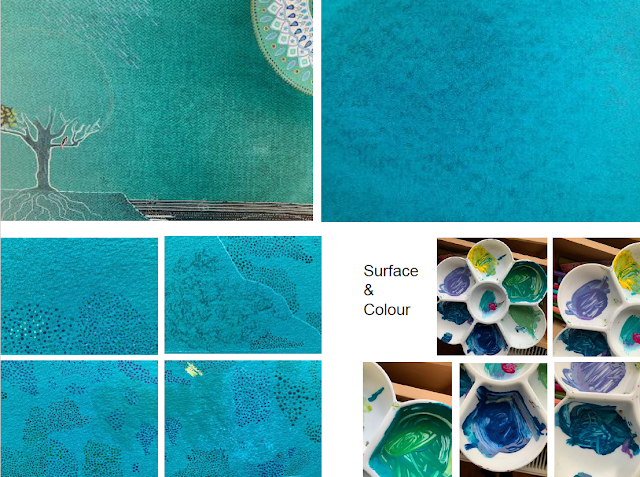
Background colour and surface: going round in circles and dots!

I am pretty certain that after spending far too long identify the right colour for the backgrounds (not too blue, not too green, not too light, not too dark) and then screen printing 18 plates (with so many others that I rejected) that I have made a mistake with the choice of paper as it does not have the same surface texture as the mock-up, a deliberate change that I now think may be wrong. I am not sure if this is simply the process of testing and refining approaches or whether I have lost all sense of perspective and judgement! Green Mock-up: textile-like surface pattern Bluer screen-printed backgrounds, less regular surface pattern (more sky-like but less variation). Testing how to give surface and colour to the 'earth' (beneath the tree and across all plates) - the ground needs to have tonal contrast with the background (darker) and to offer some visual relief ...

